Aaminah Snowdon
The material used was Acrylic Paint.
I chose this piece of work because I like the detail that Aaminah put into the feathers of the robin and giving the painting some resemblance to the actual creature. For the colours, she has used red, white, black and brown, the surface she has painted on looks to be a plain canvas. The texture of the painting looks to be very smooth and the technique that may have been used could be dry brush painting. We have used dry brush painting in class and it is a great way to make a feel of a feathery or furry texture.
Calvin Nicholls
The material used for this sculpture was paper and glue.
I chose this piece of work because unlike some of his other pieces, he uses duller colours on this one. The colours used on this are white and light brown and the texture of the surface is probably quite bumpy. If I were to make a sculpture, I would maybe be inspired to use a technique similar to Calvin's as it is very unique to sculptures you see today.
David Revoy
The material used for this concept was paint.
I chose this piece because he didn't have any other animal concepts, but I did really like the look of this piece. He has used dark and dull reds, yellows and greens. It looks like he has used a dry brushing technique to create he bird and water colours for the background. I have used techniques similar to Davids already.
Ellen Jewett
The materials used for this sculpture were clay and paint.
The reason I chose this was because Ellen has taken a normal land animal and given it an industrial look. She has used the normal colours for an otter, white, black, light and dark browns, then for the wings she used white brown and gold. If I were to make a sculpture and take inspiration from this, I would maybe use an industrial look for the creature.
Erst Haeckel
The materials used for this were paints.
I chose this because it is a simple well done piece. It looks like he may have used paints to create this. The surface that this was painted on was probably normal paper. For this, the colours he used were yellow, black, light brown and green. If I were to take inspiration from this, I would try and create shading similar to what Erst has done.
Geoffrey Dashwood
The material used for this sculpture was copper.
I chose this sculpture because it has very little detail but bears a good enough resemblance to the actual creature. He has used copper for the whole sculpture and the colour of the copper is different variations of green. If I were to take inspiration from this artist, I would make similar simple details like Geoffrey has made.
Wire Work
Helaina Sharpley
The material used for this piece was wire.
I chose this piece because the wire makes it looks like a pen drawing but it is floating. She has used wire and maybe a piece of wood painted white to mount the wire work. The colours used are white and dark grey. I have started to use wire work in a 2D fashion so I can't take to much inspiration fom this.
Pompey Illustrations
The material used for this sculpture was wire.
I chose this piece because it uses a simple design but it is still clear of what it is supposed to be. The wire that they used is possibly painted black and other than the base, is the only colour present in the sculpture. If I were to make a wire sculpture and take inspiration from this, I would try to make it just as simplistic as this one
Celia Smith
The material used for this sculpture was wire.
I chose this sculpture because unlike the other two, this one features colour and is very detailed. The colours used on this sculpture are brown, red and bronze. If I were to take inspiration from this I would use coloured wire to create more of a character for what I'm making.

Ben Roth
The material used for this sculpture was wire.
I chose this sculpture because this one looks much more detailed than the others. The artist has used thinner wire compared to the other sculptures. The only colours on the sculpture are the gray or black wire and brown from the stick. If I were to make a sculpture similar to this I would maybe cross hatch the wire to be able to mold an animal shape.

Jaroslaw Majcher
The material used for this sculpture is wire
I chose this sculpture because it has very little detail but is able to show exactly what it is. The artist has used a thin wire and wrapped multiple pieces of wire to make it look thicker. The only colour used is bronze. If I were to take inspiration from this sculpture, I would wrap the wire around itself to make simple pieces to work with.
 Kim Hunter
The material used for this sculpture is wire.
I chose this sculpture because it is a simple representation of a lizard. The artist has used thick wire to make a spinal structure for the whole body and wrapped more wire around it. The only colour on this sculpture is silver. If I were to take inspiration from this sculpture, I would make a spinal structure to base the rest of the design off of.
 Clay
Clay
Alice Shepard
The materiel used for this sculpture is clay.
I chose this sculpture because it has a simplistic design. Theses sculptures have beads for the eyes and wing shapes are etched into the sides of the body. The colours used for the sculptures are black, grey and yellow. If I were to take inspiration from these sculpture, I would etch designs into the clay.
 DeeRaaArts
The materiel used for this sculpture is clay.
I chose this sculpture because it has a cartoony feel to it. It looks like the artist made the body of the lizard first and then added on the small details onto it later. The colours used for the sculpture is green, light green, white and black. If I were to take inspiration from this, I would used the cartoon look that this sculpture has achieved.
 Karen A Johnson
The materiel used for this sculpture is clay.
I chose this sculpture because the artist has payed attention to detail, It has a smooth texture and uses what looks like metal pieces in the shell. The colours used on this sculpture are blue, black and silver. If I were to take inspiration from this sculpture, I would put metal pieces in the clay for detail.
 Carrie Wolf
The material used for this sculpture is clay.
I chose this sculpture because it has a very simple structure to it yet the artist has been able to put a good amount of detail onto it. The sculpture looks like it has had a layer of gloss put over it and it has had feather details etched onto it. The colours used on this are light brown, grey, black and white. If I were to take inspiration from this, I would probably give whatever I make a glossy finish.
 Chris Dixon
The material used for this sculpture is clay.
I chose this sculpture because it resembles what it is supposed to be very well. The artist has etched the scales on all of the body and has also put a lot of detail on the face. The colours used are a brownish green and grey. If I were to take inspiration from this, I would etch a lot of details onto it.
 Joan Curry
The material used for this sculpture was clay.
I chose this sculpture because it has very little detail but is able to represent what it is meant to be. Like the previous two, this sculpture also has a glossy finish to it. The colours on it are green and black. If I were to make a sculpture like this, I would give it a simple design.
 Animators
Tony Hart
This animator uses clay in this animation.
The characters in this animation are very simple. They both have similar structures to their bodies, also one is grey and the other is brown. The animator uses a few props for this animation which are a small bowl and a spoon.
Micheal Parks
This animator uses clay in this animation.
The characters in this animation are a bit more complex than the last animation. They both have different body types one being short, he other being taller. The green character has yellow beads for eyes, nostrils, a blue horn and a mouth. The grey character is similar except for the bead eyes, which are red. This animator also uses props in this animations which is a pen.
NarioMaru
This animator uses clay in his animation.
These characters are very simple in design. They have the same bodies and the only difference between them is the colour and headgear. Similar to the previous video, beads are used for the eyes. At the end of he video, the words Happy New Year are made from the characters.
Lula Gomez
This animator uses paper in this animation.
The origami in this animation is simple but represent the ships from Star Wars very well. The X-Wings are made from white paper whilst the Tie Fighters are made from gray paper. There are a few explosions through out the animation which are made out of yellow paper and what looks like either tissue paper or thin plastics sheets in red and yellow.
Slamacow
This animator uses computer graphics in this animation.
This animation is made on a computer with characters from the sandbox game, Minecraft. The characters are all the same except for their clothing which is purple, green and white. There is also a bottle on the table present in the animation, which is giving off light and is showing shadows on the characters.
Jonny Lawrence
This animator uses drawings in this animation.
This animation only uses a felt pen and he creator interacting with the drawings that he makes. The only colours present through out the whole animation is black from the felt tip pen and the white background.
Concept Artists
Company : Bungie
This concept artist has used computer graphics to create this piece.
In this concept, it has two different versions of an enemy from the game Halo : Reach. The colours used are red, gray, black, blue and maroon, The artist has gone into extreme detail with this concept as they have added shading and much detail to the face.

Kyle Hillard
This concept artist has used computer graphics to create this piece.
This piece looks like it could of been painted and then scanned onto a computer to further improve. The colours used are blue, red, pale yellow and pink. The artist has most likely took inspiration from an alligator to get the basic shapes of these creatures and then added on the spikes to make it look like those from the Pokemon games.
 Jan Urschel
This concept artist has used paint to create this piece.
This piece shows one of the many features from the game Assassin's Creed IV Black Flag, harpooning. The colours used are blue, gray, red, brown and black. The artist has made sure that he waves look as realistic as possible by adding foam to where disrupted water is.
 Guillaume Menuel
This concept artist has used paint to create this piece.
This piece shows the front and back of a character from the Assassin's Creed series. The colours used are peach, grey, brown, black, white and orange. The artist has shown great detail within sections like on the wolf pelt and has made it look like a soft pelt.
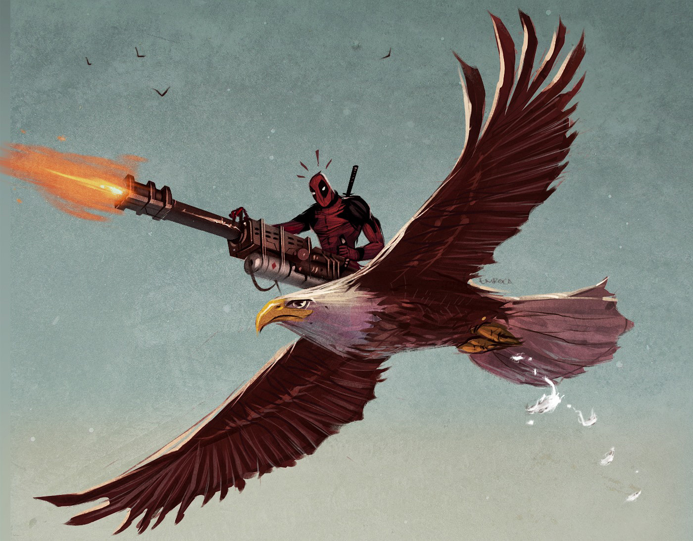
 Jose Emroca Flores
This concept artist has used paint to create this piece.
This piece shows a comic book character from the popular Marvel series. The colours used are black, red, white, brown, gray and orange. The artist has gone for a comical look with this piece.

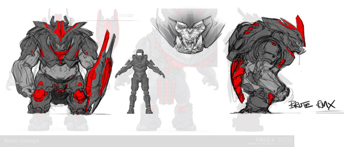
Company : 343 Industries


